Dashboard design
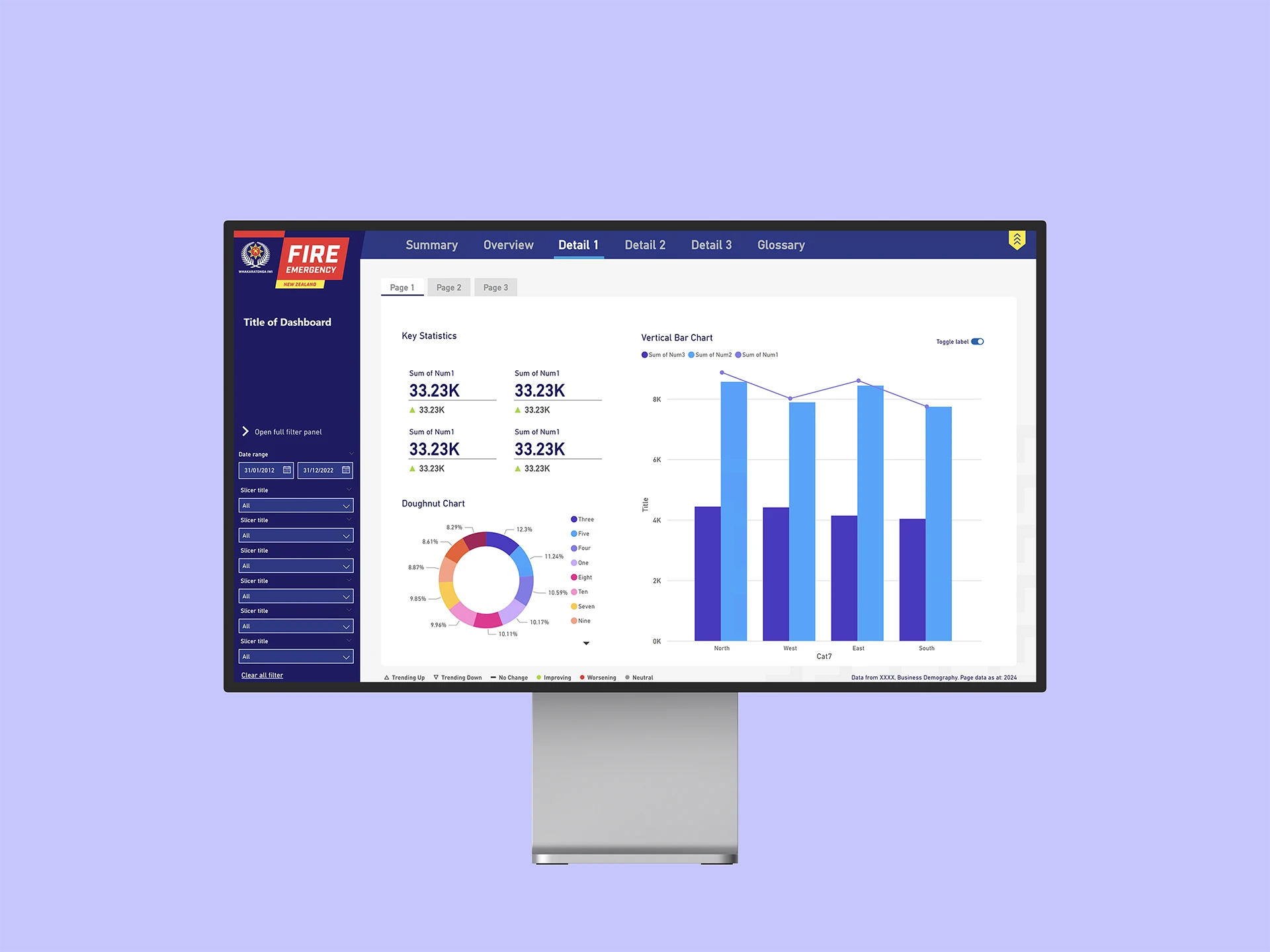
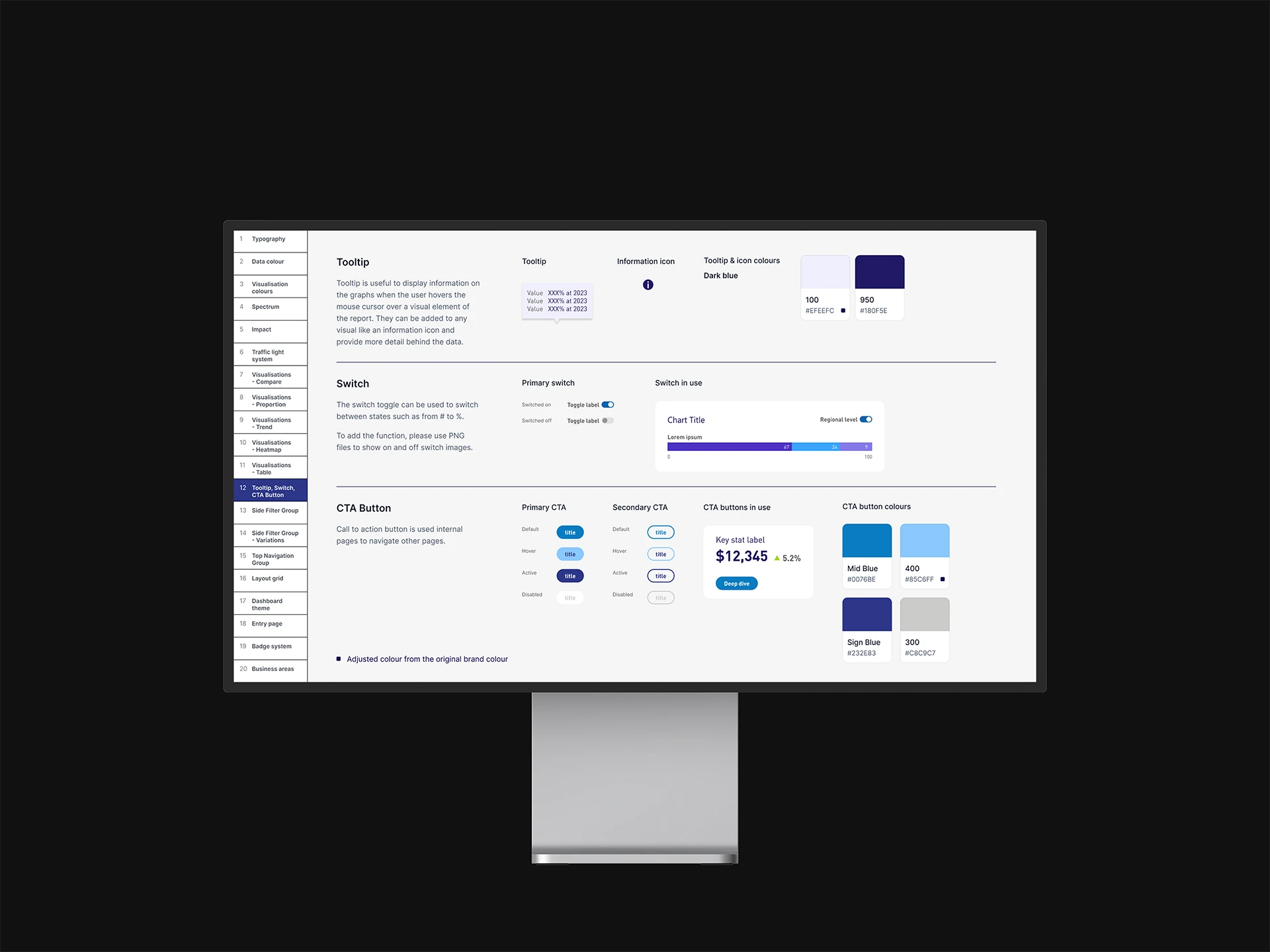
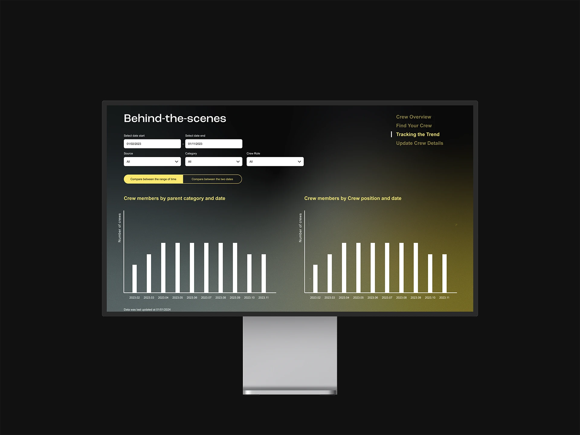
At Dot Loves Data, I collaborated with data scientists and creative directors to design Power BI dashboards that were both functional and aligned with each client’s brand. We began by researching the client’s brand and understanding user needs, then created user journey maps to guide the dashboard’s structure. After developing wireframes and high-fidelity designs, we refined them through client feedback. For some projects, like FENZ, we also created style and user guides to ensure consistent design across future dashboards. This work reinforced my belief in the power of human-centred design for even the most technical tools.
Credits
Creative director — Charlie Lee Data scientist — Dmitri Schebarchov Project manager — Penny Coleman
Clients
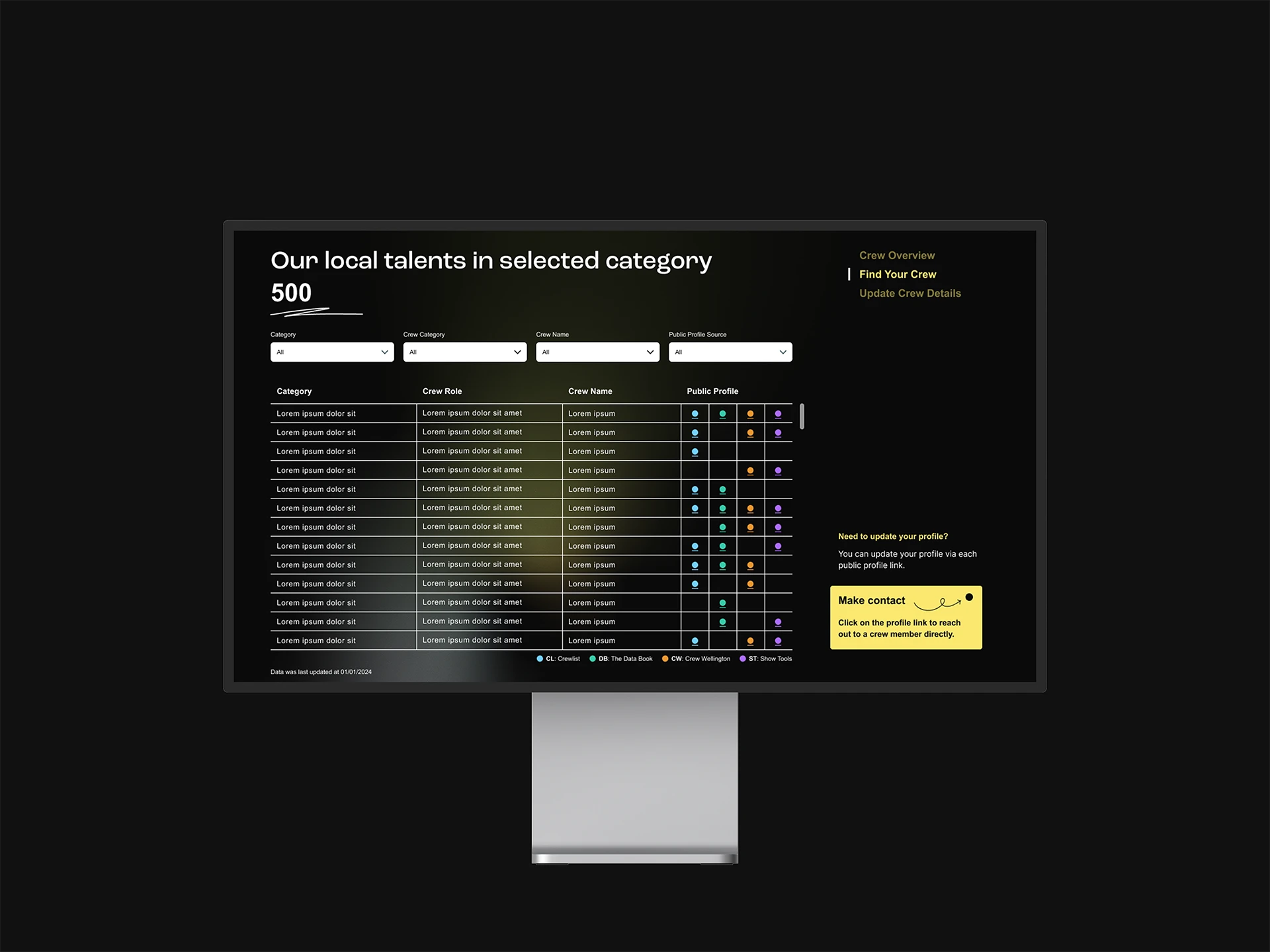
FENZ, Screen Wellington, etc.
Deliverables
Dashboard design, UX/UI design, PowerBI template


Summary
Mission
To design intuitive and branded Power BI dashboards that catered to the unique needs of each client. The goal was to create data visualisations that were not only functional but also user-friendly, ensuring that the dashboard experience was both seamless and engaging. I aimed to combine a user-centred approach with the constraints of Power BI, finding creative solutions to improve both the usability and the visual appeal of the dashboards.
My Contributions
I worked closely with data scientists and creative directors to research client brands, map user journeys, and design wireframes and high-fidelity dashboards. My focus was on aligning the design with client requirements while ensuring an intuitive user experience. For projects like FENZ, I also helped develop style and user guides to maintain design consistency across future dashboards. This experience deepened my understanding of creating systems and interactions that are easy to use, even when working within the limitations of a tool like Power BI.